A Design Rethink
Hi again
Is it possible to look into a redesign of this section of the upload to quickbooks:
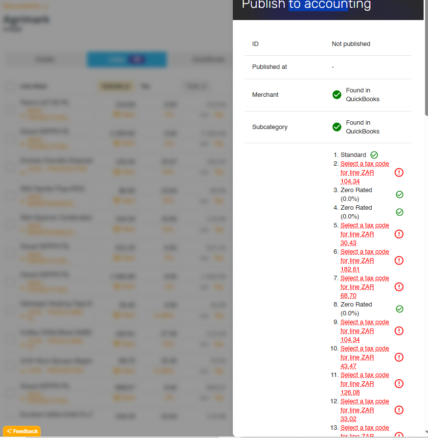
Trying to determine what tax rate matches which line when all you can see is an amount on such a list is not easy. Simplest idea froma user perspective is to have the tax rates either paired together in the settings, or just have the option to select a tax rate from the quickbooks imported list initially so that we dont have to do it twice.
I suppose there was a reason Sparkreceipt had it own tax rates at one point, but maybe it is possible to replace these tax rates with the quickbooks ones when a quickbooks connection is made?
Log in to comment and vote
Comments4
Jukka Tupamäki
Oct 9, 2025
Thank you very much. In your case the UI definitely would need some polishing, more space at least. 😮💨
We’ll try to figure out something when we have the time to focus more on QBO issues.